
Two shirts can come off the same press on the same afternoon with the same design, and one will have crisp lettering while the other looks like it was printed through a screen door. I have made both. The blurry one taught me more than the sharp one did, and almost none of it had to do with the heat press itself. It came down to the paper, the moisture in the room, and four small habits I had to build before my transfers stopped going soft around the edges.
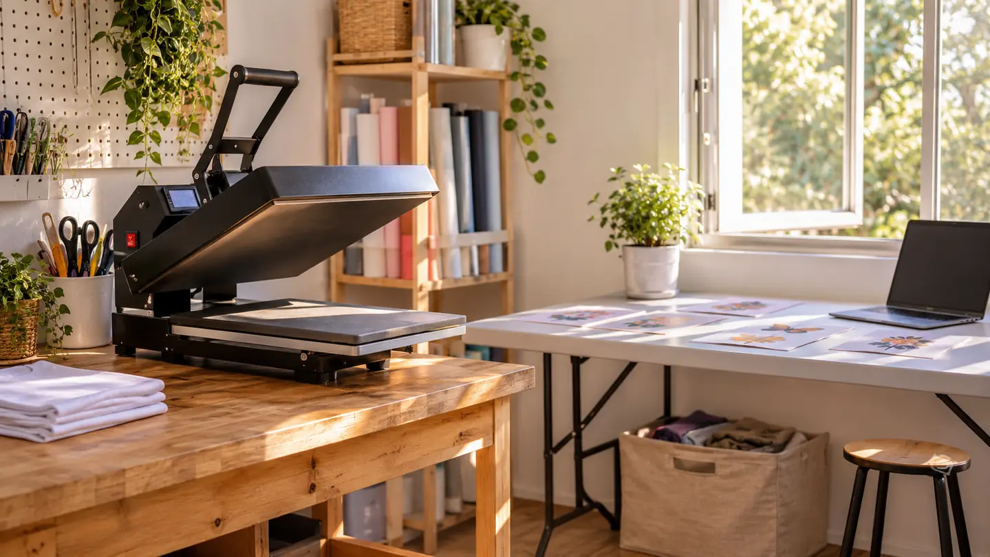
I press in a spare bedroom in Evansville, Indiana, mostly polyester shirts for coworkers, neighbors and my church, plus a run of tumblers here and there. The paper I use is A-SUB Sublimation Paper, 8.5 by 11 inches, 110 sheets to a pack, 125 g. I moved to it in May at the same time I moved to a real sublimation printer, after a spring of generic sheets and blurry results, and the sharper edge was the first thing I noticed on the very first shirt. It is not a fussy product. It is paper that takes ink evenly and lets it go evenly, which is most of what the word sharp actually means.
The sheet that ended my soft edges
A-SUB Sublimation Paper, 8.5 by 11 inches, 110 sheets. Works only with sublimation ink, on white or light polyester and on coated blanks.
Amazon See the A-SUB paper on Amazon →Step 1: Find the Coated Side Before You Load the Tray
Sublimation paper has a coated face and a plain face, and the ink has to land on the coated one. Load it backwards and the sheet still feeds, the printer still sounds perfectly normal, and the transfer comes out pale and soft because most of the ink sat on top of the paper instead of soaking in. This is the easiest mistake to make in the beginning, and it looks like every other problem until you check the sheet.
The way I check is quick. I hold the sheet by one corner and run my thumb across the face. The coated side on the A-SUB sheets is the brighter, slightly slicker one. If it feels like plain copy paper, I have it upside down and I flip it before it goes anywhere near the printer. Two seconds, every single print, even after months of the same pack. The sheets stack coated side up in the pack, so it is easy to grab one the wrong way when I am talking to Gary and not paying attention.
The coated side of a sheet and the plain side look close to the same under a lamp, and that is the whole trap. Print on the wrong face and the transfer comes off looking like the design seen through a fogged bathroom mirror. Nothing warns you. The sheet feeds fine, the print looks fine, and a beginner will blame the press, then the shirt, then their own eyes. Pressing it a second time only makes the image darker and softer. So before every print I hold one sheet up to the window light, where the difference between the two faces is obvious, and I load the pack the same way every time. It is a two-second habit, and it is the cheapest one on this list.
Storage matters more than people expect. These sheets curl in a humid room and Evansville in July is more or less a humid room. A curled sheet will not lie flat against the blank, and any spot where it lifts is a spot where the transfer goes soft. I keep the pack flat in a drawer, never standing on its end, and I pull out only the sheet I am about to print. The rest stay closed up.
Step 2: Mirror the Design and Print It Dull on Purpose
Sublimation pushes ink into the surface of the blank, so the image has to print in reverse or every letter comes out backwards. I mirror the design in my software before it ever reaches the printer. It is one checkbox, and it is easy to skip when you are in a hurry. If your text is backwards on the finished piece, this is the reason, and no amount of pressing will fix it.
The other half of sharp is ink density. My Epson F170 only prints 8.5 by 11, and I run it on the high quality setting for anything with small type or a fine line. Here is the part that confused me at first, though: the print on the sheet is supposed to look a little dull. It sits in the tray looking washed out and faintly grainy. That is normal. Too much ink and the sheet buckles and the transfer blots at the edges. Too little and the edges go thin and gray. The right amount looks unimpressive on paper and correct on the shirt.
I also keep the design off the outer quarter inch of the sheet. The printer holds the paper at the edges and the coating is less dependable right there, so a design that runs to the very border will have one soft side no matter what I do at the press. Better to print a little smaller and keep the whole image inside the safe area.
The setting to watch is the plain paper default. My laptop wanted to hand the F170 the same profile it uses for printing a receipt or a church newsletter, and on that profile the ink goes down heavy. Heavy ink on a sublimation sheet does not look heavy. It looks fine, then the sheet comes out of the tray with a slight wave in it, and that wave lands on the shirt as a pale blistered patch along one edge of the design. I built one named preset for the F170, sized to letter paper, high quality, and I never touch it again. The rest of the settings on that laptop are not my business anymore.
Step 3: Dry the Sheet and Dry the Shirt
Moisture is the quiet cause of most soft transfers, and almost nobody mentions it. A-SUB paper that has pulled humidity out of the air will release steam under the platen, and steam pushes ink sideways as it escapes. The shirt is the same story. A polyester blank that has been hanging in a closet holds damp, and pressing it straight off the hanger gives a foggy transfer with no clean edge anywhere.
So I do two quick things before the real press. I give the shirt a few seconds in the press on its own, just to push the damp out, and I let the printed sheet rest on the open platen while I do it. Nothing dramatic, no ironing the paper, no oven. On a rainy week I also run a lint roller over the shirt. One stray fiber under the sheet shows up as a bright speck in the middle of a transfer, and there is no repairing that afterward.
Humidity matters more than most beginners expect. On a damp stretch in Evansville the sheets out of the pack can feel faintly limp, and damp paper tends to leave a milky haze across the middle of a design, edges fine, center soft. Nothing about the press has changed. The air has. So on humid days I set each printed sheet on the open platen for a minute while it warms and pre-press the shirt for five seconds first. That drives the moisture out of both, and it costs almost no time. I also keep the pack flat in a drawer rather than out on the table.
If a sheet has picked up a visible ripple, I set it aside for a test print instead of using it on a shirt for someone else. A rippled sheet never flattens all the way, and the part that stays lifted is exactly the part that comes out blurry.
Step 4: Match the Blank, the Pressure and the Time
Sublimation only bonds to polyester and to blanks that were coated for it. My white and light polyester shirts press at 385 F for 50 seconds on the 15 by 15 clamshell, and I do not move that number around. When I am pressing a coated blank of some other kind, I follow whatever that maker says, because the coating matters as much as the setting does. The press is not where you innovate. It is where you repeat.
Cotton is the one that trips up every beginner. Cotton does not take sublimation ink at all, no matter how long you hold it or how hot you go. Designs for cotton go on as vinyl instead, and I cut those from a roll of Siser EasyWeed and press at 305 F for 15 seconds, peeling hot. If someone hands me a dark cotton shirt and wants a photo printed into it, the honest answer is that my setup cannot do that, and I say so up front.
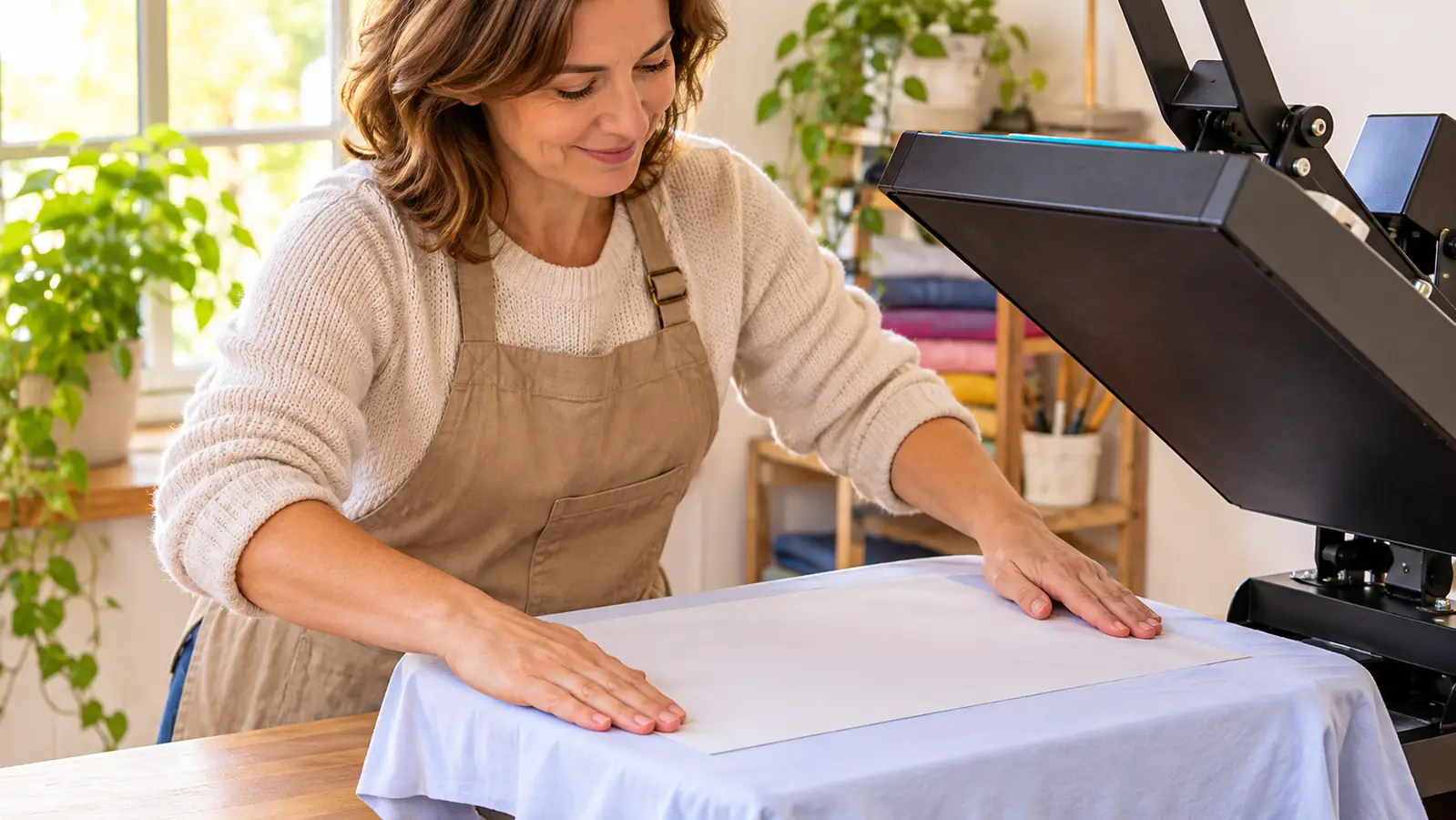
Pressure wants to be firm and even, not crushing. I close the clamshell and let its own weight do the work. Too light and the sheet does not touch the shirt everywhere, which is precisely what a soft edge looks like. Too heavy and the paper can shift or wrinkle under the platen, and a wrinkle in the sheet is a crease in the transfer.
One more thing about the press itself. The number on the display is not gospel. Mine can read 385 F while my infrared thermometer says the platen is still catching up, and a low platen gives you dull, undercooked edges. I let it sit another four or five minutes, check again, and it settles where it should. Now I take that reading before a batch of more than two shirts, and if it is low I wait rather than push the setting up. Chasing the display upward is how people end up scorching a blank that had nothing wrong with it.
Step 5: Tape It Down, Then Pull It in One Motion
Heat tape at two corners is the difference between a sharp transfer and a double image. The sheet shifts a hair when the platen comes down, and a hair is more than enough to ghost the edge of a letter. I tape the top and the bottom, press the tape down with my thumb, and then the sheet stays exactly where I put it. This one habit cleaned up more of my fine text than anything else on this list.
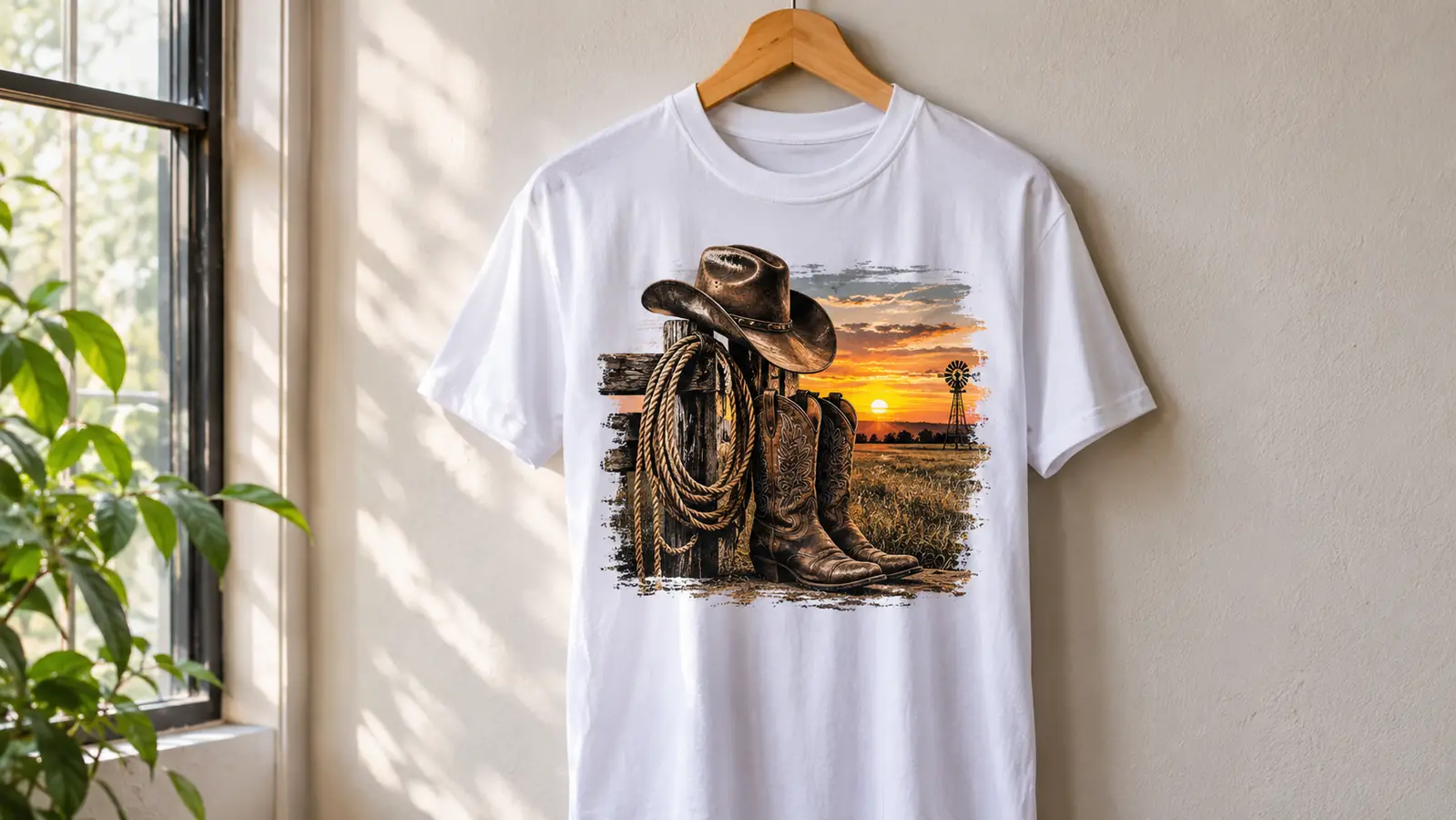
I press at 385 F for 50 seconds, open the press, and lift the sheet from one corner in a single steady pull while it is still warm. Peeling slowly, or waiting until it is cold, is how you get a jagged edge on small type. Gloves on for this part, because the platen and the shirt are both hot enough to matter. I have not burned myself yet and I would like to keep it that way.
The shirt gets a minute to cool flat before I fold it or bag it. Folding a warm transfer puts a crease line straight through the image that will never come out, and it is a shame to ruin a good press with a bad fold.
A soft transfer wastes a shirt, not a sheet. That is why I stopped guessing on the paper and started checking the coated side every single time.
What Else Helps
Two habits made more difference than any single product I have bought. The first is a cheap infrared thermometer. The number on my press display and the real temperature of the platen are not always the same, and a press that reads 385 F while actually running at 370 F will give you a transfer that looks underdone around the edges. I point the thermometer at the platen before a run of shirts and adjust if it has drifted. That is the whole ritual.
The second is a weekly test print on the Epson F170. Sublimation ink settles when it sits, and a printer that has been idle for a couple of weeks will lay down ink with gaps in the coverage. Those gaps show up as streaks in the finished transfer and I would absolutely blame the paper for them. One small test print every week or so keeps the ink moving and tells me the head is clean before a blank is on the line. Nine times out of ten it uses a corner of one sheet and saves a whole shirt.
For tumblers, the sheets come off the same printer and go onto 20 oz straight tumblers at 365 F for 150 seconds in the tumbler press, one at a time. Tapered tumblers do not sit right in it and I tell people that up front rather than take the order and hope. And if you are still deciding which paper to start with, the short version is that the cheap generic sheets are where my soft edges came from in the first place.
Sharp edges start on the sheet
A-SUB Sublimation Paper in 8.5 by 11 inches, 110 sheets. For white or light polyester and coated blanks, with sublimation ink only.
Amazon Check availability on Amazon →